Search

In any endeavor—whether managing a multi-million-dollar project or cultivating a new personal habit—seeing concrete evidence of advancement transforms abstract goals into tangible milestones. By translating raw numbers into clear, engaging visuals, you tap into the human brain’s innate ability to interpret graphical data far more quickly than raw text or tables. Effective progress visualization not only condensing complex data into visuals but also fuels sustained action, guides better decisions, and fosters a shared sense of accountability across teams and individuals.
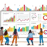
Data visualization is the practice of turning volumes of figures into charts, graphs, or interactive dashboards that bring insight to light. When the focus narrows to tracking progress, these tools become powerful motivators, offering a real-time snapshot of where things stand relative to your objectives.
At its core, progress visualization delivers:
Imagine a sales team reviewing a line graph that charts monthly revenue: a sudden dip draws immediate attention, sparking a swift inquiry into its cause. Likewise, personal habit trackers use progress bars to show how close you are to a fitness goal, driving daily commitment with a psychological boost every time the bar moves forward.
Selecting the right visualization depends on the nature of your data and the story you wish to tell. Here are some of the most common options for illustrating progress:
Each format brings unique strengths. A bar chart is ideal for comparing discrete figures side by side, while a line graph highlights gradual momentum or decline over days, weeks, or months. Pie charts distill a whole into parts, making them perfect for completion rates. Gantt charts provide a visual blueprint of tasks and timelines in project management, and interactive dashboards marry these elements to support real-time tracking of key metrics.
To ensure your progress graphics communicate clearly and inspire action, follow these guiding principles:
By eliminating unnecessary design elements and zeroing in on key information, you ensure your audience perceives value instantly rather than grappling with a confusing chart. Interactive features—filters, hover details, or drill-downs—further enrich user experience when working with more complex dashboards.
The market offers a spectrum of tools tailored to various needs and budgets. Basic spreadsheet software like Excel or Google Sheets excels for quick, ad hoc visualizations, while advanced platforms such as Tableau, Power BI, or specialized project-tracker apps unlock deeper interactivity and collaboration.
Consider the following when evaluating your options:
For example, a small nonprofit might leverage free Google Sheets templates to track fundraising progress, while an enterprise sales division might invest in Tableau Public or Power BI to deliver polished executive dashboards with advanced filters and alerts.
Incorporating charts and graphs into your workflows transforms intangible goals into vivid, actionable insights. Whether you’re an individual striving to build a new habit or a global team aligning on strategic milestones, progress visualization serves as both compass and fuel—guiding decisions while igniting motivation.
Start simple: choose one meaningful metric, pick an appropriate chart type, and build a basic visualization. Share it with peers or mentors for feedback, refine your design, and commit to frequent updates. Over time, evolve toward more sophisticated dashboards that allow stakeholders to enable interactive data exploration and dive deeper into the story behind the numbers.
By embracing these techniques, you cultivate a culture where data is not a static report but a living narrative—illuminating achievements, uncovering challenges, and inspiring the next breakthrough. Let your visualizations chart the path to your goals and empower everyone involved to celebrate progress every step of the way.
References